UPDATE: The video below is out of date. Check out the one above instead. Like the original, it tells you what dimensions are best for your IGTV cover thumbnail images, but also takes into account what titles, overlays, and cropping in the search grid will do to your thumbnail.
Also, see my updated article, Make Your IGTV Cover Look Good Everywhere.
For historical purposes, here is the original video:
Instagram’s IGTV was launched yesterday, bringing a long-form video option to Instagram users and creators. Videos created on the platform are meant to be watched on smartphones held in a vertical position and take full advantage of the dimensions of the screen in that orientation. Creators have the option of providing a cover image for each post, which is also taller than it is wide. Unfortunately, this cover image is not 1080 pixels by 1920 pixels. It isn’t a 9×16 ratio either. Instead, it removes what appears to be 120 pixels from both the top and bottom of a 1080×1920 image while preserving the sides. It also rounds the corners of the image. So, if you want to avoid having your image cropped, use a 1080×1680 image or similar.
How I Tested
If you care about the details, I created an 1080×1920 image of rectangles within rectangles. Each rectangle is smaller than the last by 20 pixels on each side. I gave them different colors so I could easily see where the cutoff was. It looked like this:
Click to download my IGTV Cover Dimensions 1080 x 1920 Test Image to try yourself.
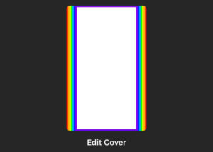
Once the above image was added as a cover image in IGTV, it produced this:
Notice that the entire rainbow is shown on the sides but only the purple avoided being cropped from the top and bottom. The top of the purple band is 120 pixels in from the top and 120 pixels in from the bottom (1800 pixels from the top).
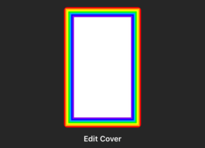
I repeated the test with a 1080×1680 image and it produced this:
Click to download my IGTV Cover Dimensions 1080 x 1680 Test Image to try yourself.


Pingback: Make Your IGTV Cover Look Good Everywhere - The K Guy()