In IGTV Cover Dimensions, I reported that a cover image of 1080×1680 px avoids cropping in the IGTV app. As of April 2020, things have gotten a bit more complicated. IGTV now expects a 120 px border around your 1080×1680 px or else it will crop out parts of your design. Adding this border means your final image will be 1320×1920 px.
And that isn’t the whole story. There are at least three places your cover image will show up and, when it does, it will have different cropping and different text and image overlays.
The three locations I’m referring to are:
- The IGTV app (and IGTV interface within the Instagram app)
- The instagram.com website
- Search within the Instagram app
IGTV Cover In The IGTV App / Interface
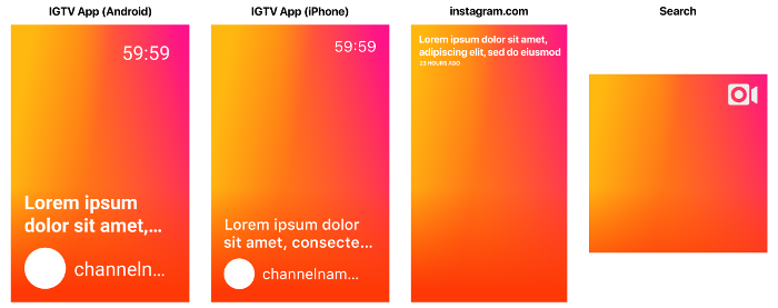
As I covered in a previous post, the aspect ratio here is that of a 1080×1680 px image (the 120px border on all sides changes the aspect ratio to 1320×1920, but we only care about the part that is not cropped out, which remains 1080×1680). The overlays can be broken down into those that are always shown, those shown when browsing (versus looking at a particular channel), and those shown in special circumstances. In the pictures, I put my best guess as to what the font and font size in pixels would be for an iPhone with iOS 11 if the image were scaled up to 1080×1680 px.
IGTV Cover Overlays Always Shown
IGTV Cover Overlays Shown When Browsing
IGTV Cover Overlays Shown Under Special Circumstances
- Reason for showing video (Recommended or Popular). Shown when browsing in the For You tab.

- Progress bar. Shown if you’ve started but not finished a video.

- The “Watched It” checkmark circle. Shown if you’ve watched to the end.

IGTV Cover On The instagram.com Website
The IGTV section on your instagram.com website profile page shows your videos, but it crops their covers differently than the app does. When I scaled these images to a height of 1680 px, the width of these covers became 945 px, a reduction of 135 px from 1080 px. So they are cropping off 67 to 68 px from each side.
The overlays are:
The overlay text on instagram.com depends on the length of your IGTV video’s title. According to my tests, you can have five lines of title text, but given that the app limits your title text to about two lines, I’m showing what it looks like with two lines.
IGTV Cover In The Instagram App Search Page
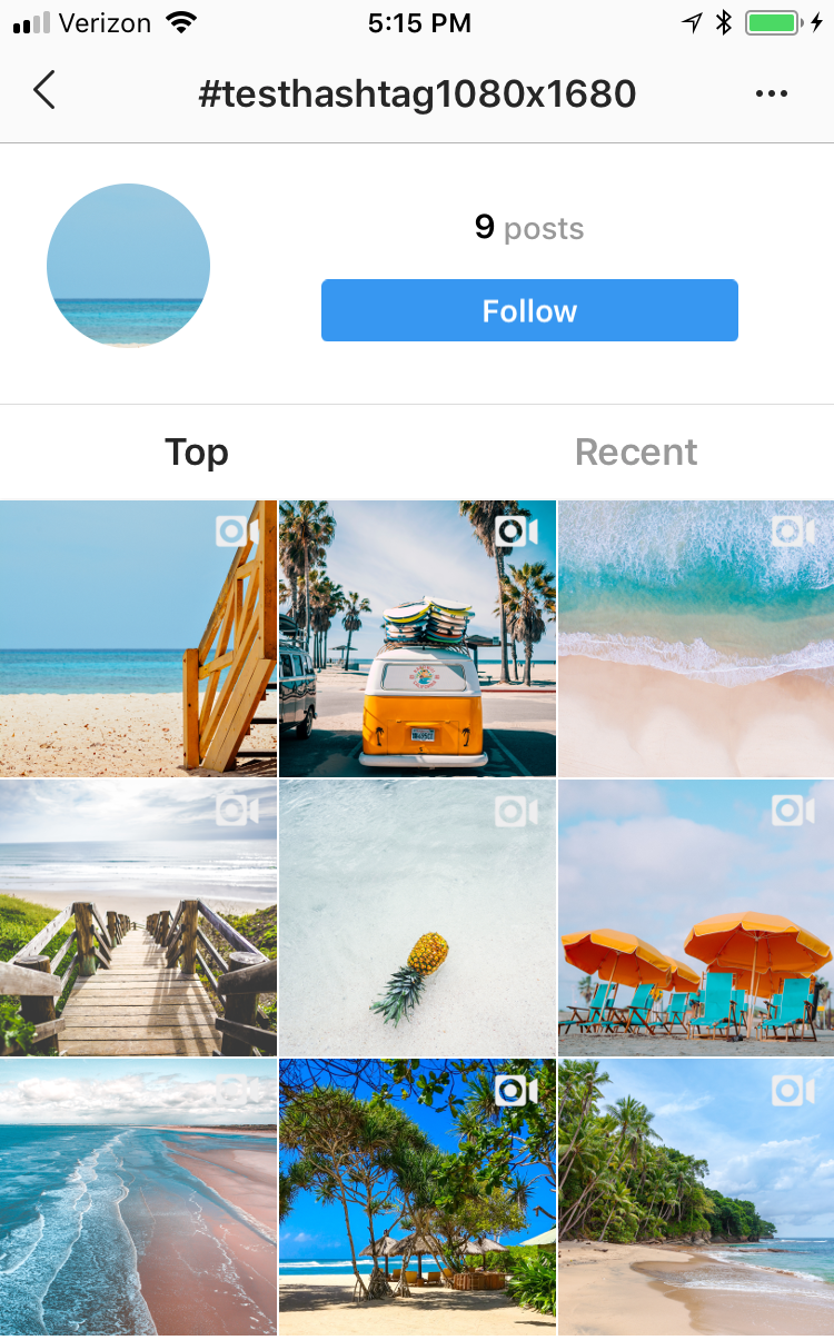
The easiest way to find out how your cover will show up in search is to use your personal hashtag in your video’s description or in a comment on your video and search for it. You will see your cover image under that hashtag in a grid and it will have square proportions, no title, and a video camera icon in the top right. I verified that Instagram is cropping the same number of pixels from the top and bottom to get from a 1080×1680 aspect ratio (1320×1920 with border) to a square aspect ratio.
Since there is no title text, so you may want to consider having your title text as part of the cover image itself even if that would make it redundant in the IGTV interface. Of course, there’s no need for the title you draw on your cover image to be the same as the title you give it in IGTV.
If one taps on any of the images in this view, they are taken to a feed view centered on the post they tapped. Here, the cover image has no overlays and takes up much of the screen except for the space at the top for the search term and the space at the bottom for the navigation buttons. Your cover image disappears almost immediately and your video starts, so it may not be worth optimizing your cover for this view.
An Example IGTV Cover
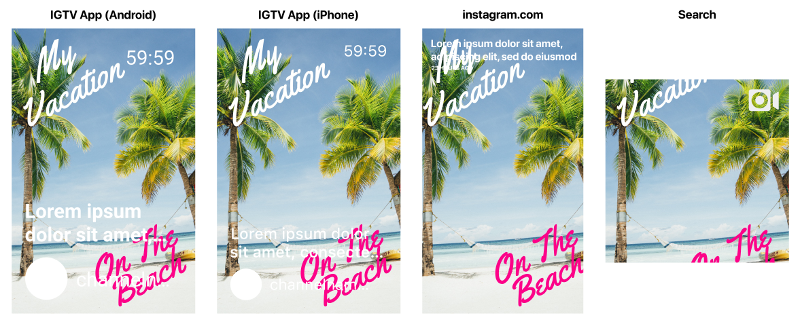
Let’s use an example to see how these overlays and alternate aspect ratios may affect a real IGTV cover. Let’s say the following image is my IGTV cover image:
Applying the IGTV App overlays, the instagram.com cropping / overlay, and the search cropping, we get the following:
Though not shown above, in the IGTV App, the “My” in “My Vacation” would be covered by the progress bar if you got part of the way through the video and came back to it. If you finished watching it, the “My” in “My Vacation” would be covered by the “Watched It” checkmark. Most of the “On The Beach” is covered by the title and channel name. In the instagram.com website, the “My” in “My Vacation” is almost completely covered by the title and “elapsed time since upload” display. Note that IGTV and the instagram.com website will darken your image slightly so that the white text and image overlays stand out against it. Finally, in the search window, almost all of the text is cut off.
Free IGTV Cover Templates
I created an IGTV Cover Overlays file in several formats (Photoshop, Pixelmator, and Gimp) with each element on its own layer so that you can turn them on and off independently. The iPhone templates use Apple’s San Francisco typeface (Windows users will need a program like 7-Zip to extract the font otf files from the dmg) to match as close as I can to the font I’m seeing in the IGTV app on my iPhone 7 running iOS 11. The Android templates use the Roboto typeface to match what I see on a friend’s Android phone (thanks, Will!). Be sure to download and install the typeface if you don’t already have it and want the template to use it. You can use the template to see approximately how your cover image and your title would look before you publish your video.
Adobe Photoshop IGTV Cover Template
- iPhone IGTV App Overlays
- Android IGTV App Overlays
- instagram.com website overlay and crop window
- Search crop window
Pixelmator IGTV Cover Template
- iPhone IGTV App Overlays
- Android IGTV App Overlays
- instagram.com website overlay and crop window
- Search crop window
Gimp IGTV Cover Template
- iPhone IGTV App overlays
- Android IGTV App overlays
- instagram.com website overlay and crop window
- Search crop window


Pingback: IGTV Cover Photo Dimensions - The K Guy()
Pingback: The Secret Instagram Feature Hidden in IGTV Video - Ep 106 - Zoetica Media()